

Grandpa Joe’s Spices
Brand Development
A behind-the-scenes look at how I build a family spice-rub brand from scratch — strategy, illustration, color, and packaging exploration in real time.
The Challenge
The challenge is translating a personal family origin into a clear, scalable brand system — one that feels homemade, but reads quickly and confidently on a shelf and across digital.
The Insight
The identity needed to feel like the person behind it: friendly, approachable, and instantly recognizable. Anchoring the brand around “Grandpa Joe” makes the story tangible — and creates a foundation that can grow across products while staying true to the family behind it.
Origin Story
How “Grandpa Joe’s”
Got Its Name
Grandpa Joe started blending spices to cut back on salt, sugar, and unpronounceable additives. After a lot of tinkering and taste-testing, he landed on a rub with just the right kick, using fresh bulk spices for consistency and flavor. Friends and family kept asking for refills. One night at a burger cookout, his grandson said, “I want Grandpa Joe’s Spice on my burger.”
The name stuck — and a backyard favorite began its journey toward becoming a real brand.
What I’m Building
Grandpa Joe’s Spices is a homegrown spice-rub brand rooted in family stories, warmth, and handcrafted flavor.
I’m developing the full identity system — from character illustration and logo design to color, packaging, and launch-ready storytelling.
The goal is a brand that feels personal and familiar, while still being clear, scalable, and confident on shelf and across digital.
Current Status
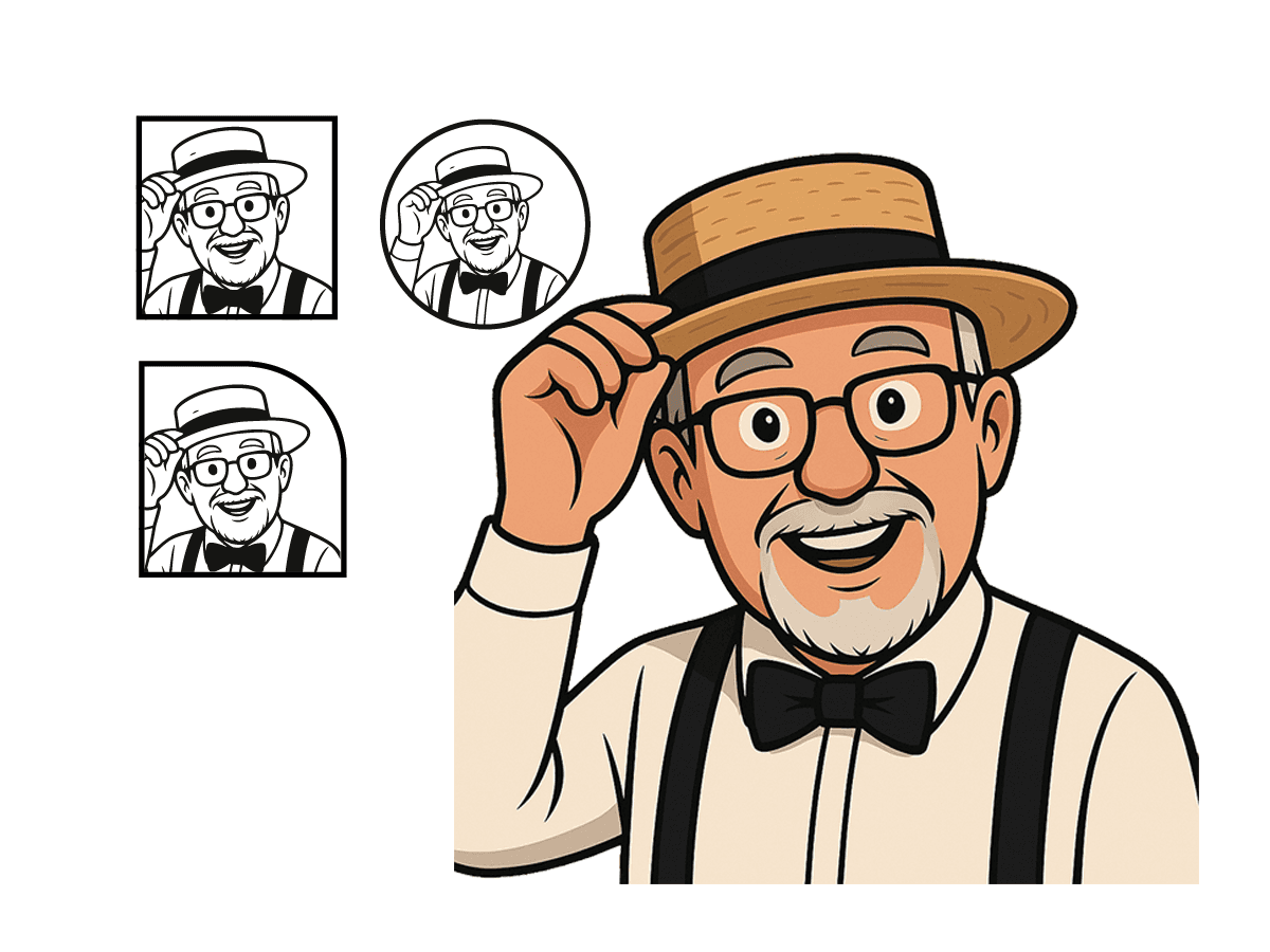
Character illustration complete, establishing Grandpa Joe as the visual anchor.
Color palette exploration underway, pulling from spice-inspired tones and neutral balances.
Logo lockup refinement in progress, testing multiple badge and framing options.
Packaging layout sketches beginning, focused on hierarchy and readability.
Shelf mockups and social graphics planned as next steps.
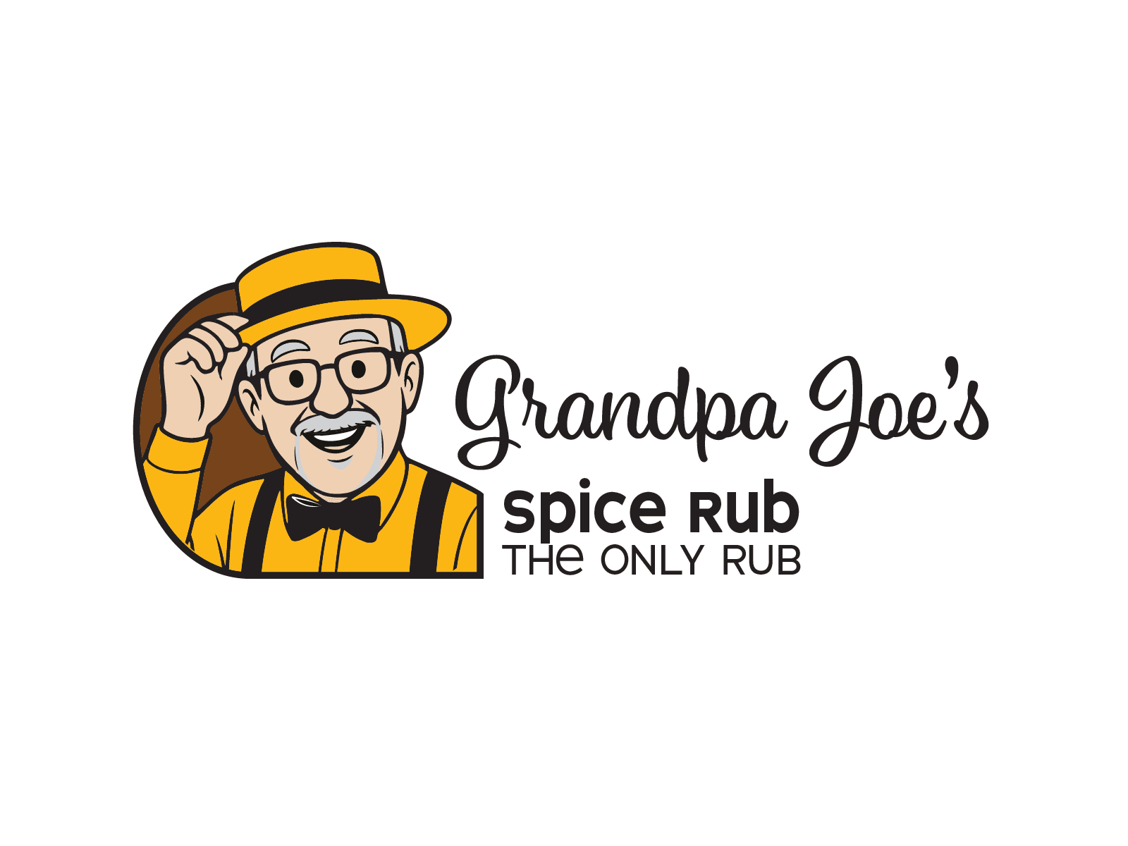
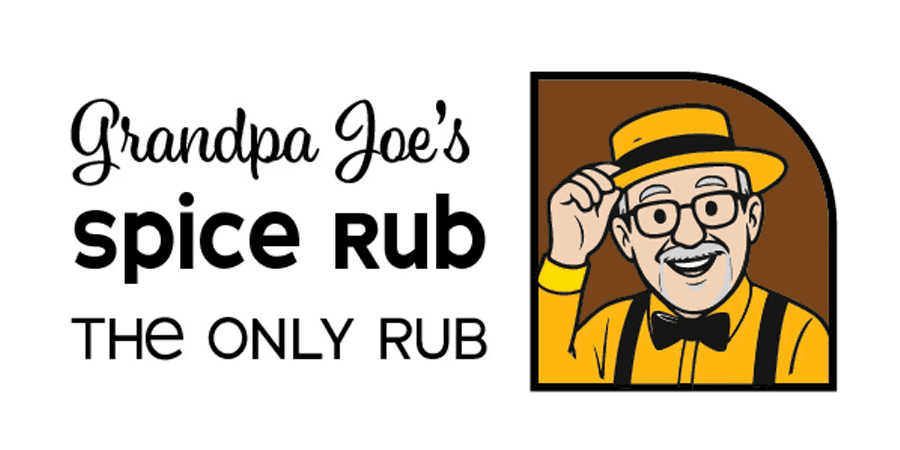
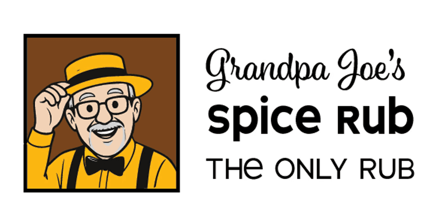
Logo Exploration
Finding the Right Expression of Grandpa Joe.
The identity centers on Grandpa Joe himself, friendly, approachable, instantly recognizable, and always smiling.
These early logo studies explore different containers and crops while keeping the same warm, line-art character at the core.
Color Story
Spice-Inspired Palettes
The palette pulls from chili, paprika, turmeric, brown sugar, char, and herbs, warm enough to feel homemade and balanced with neutrals so the brand can expand across products without feeling chaotic.


From Research to Concept
Before designing anything, I broke the brand down into its core ingredients, including product use, flavor profiles, visual cues, and storytelling. This ensured that every design decision was grounded in clarity and purpose.
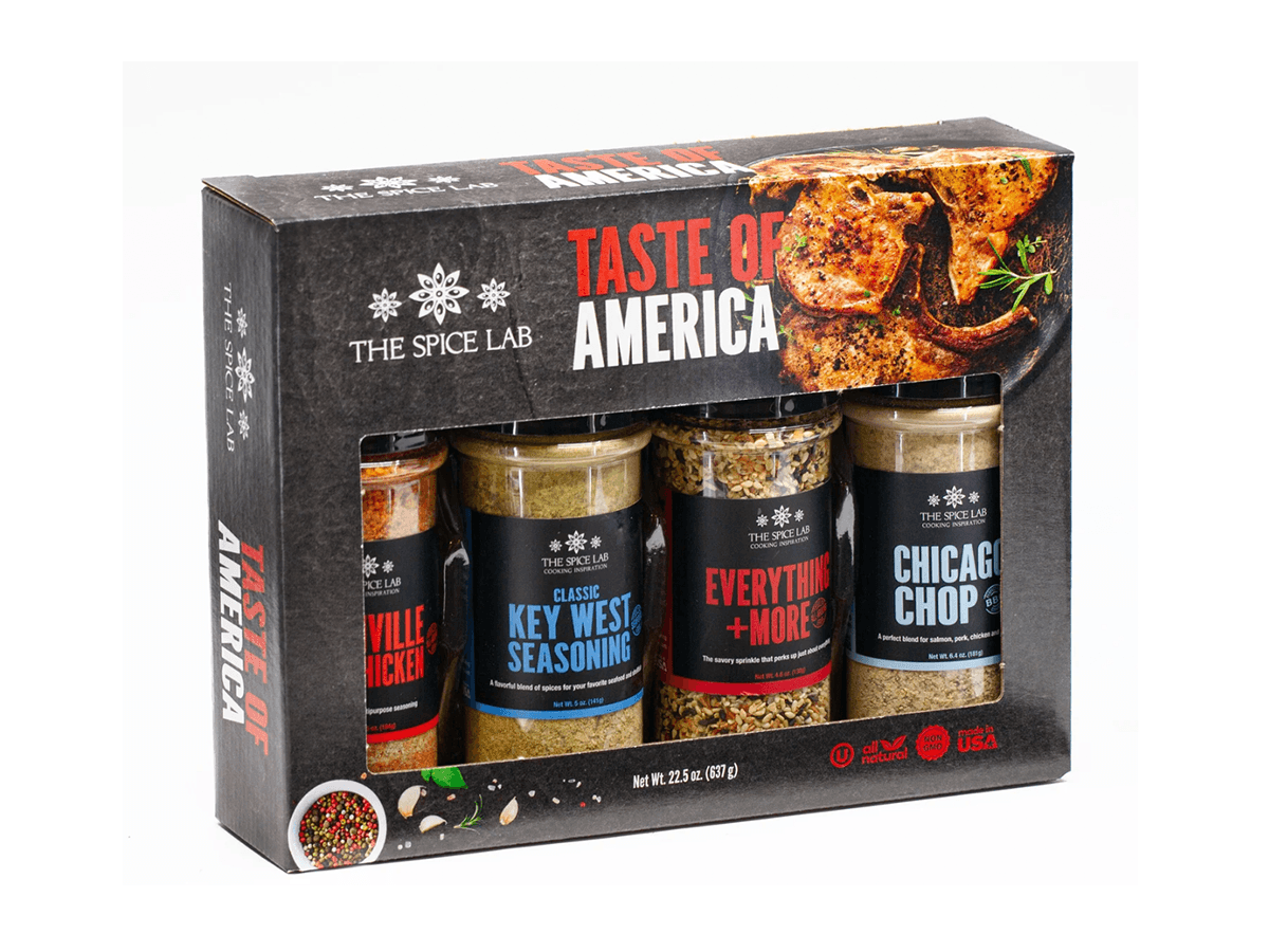
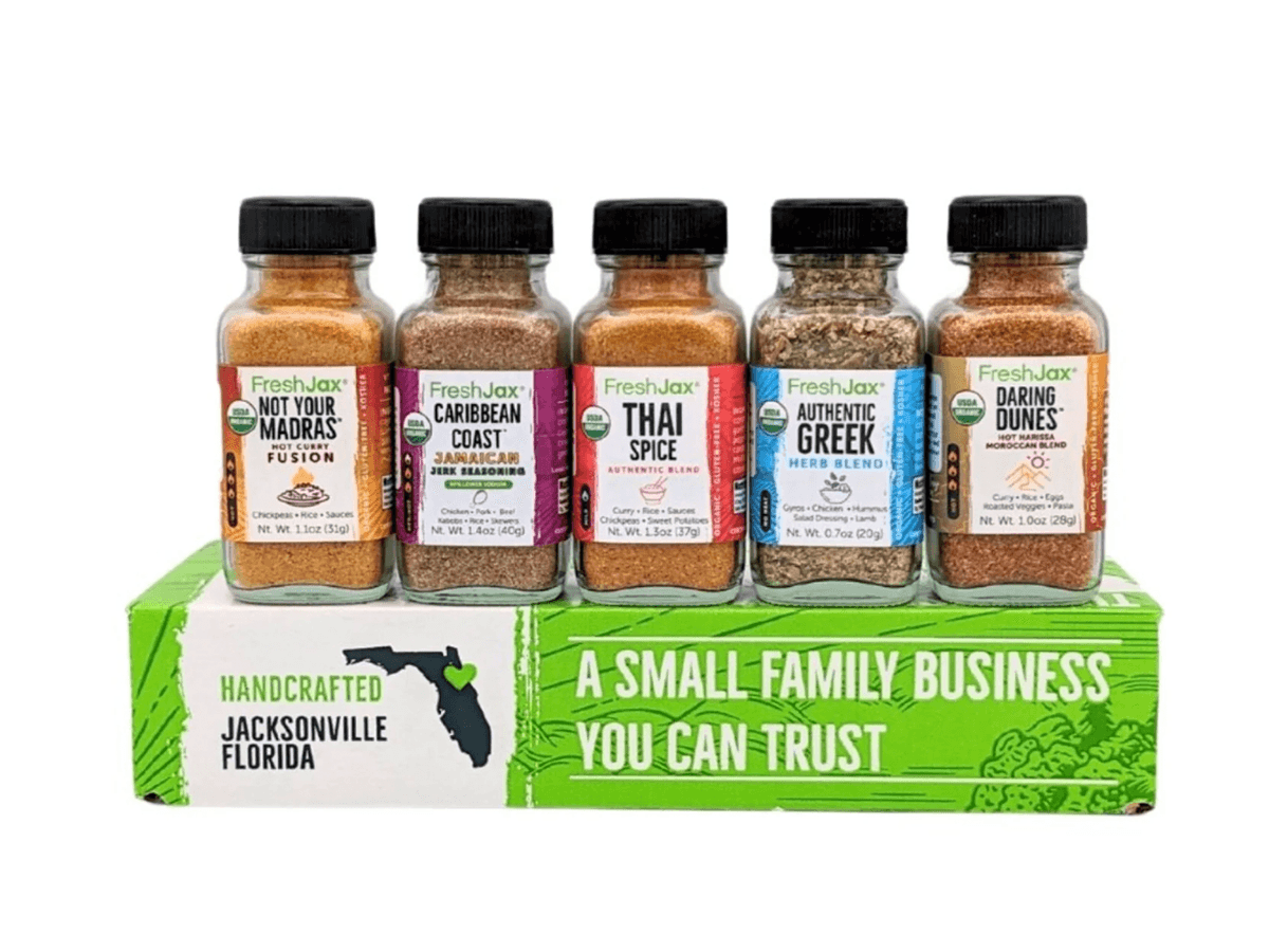
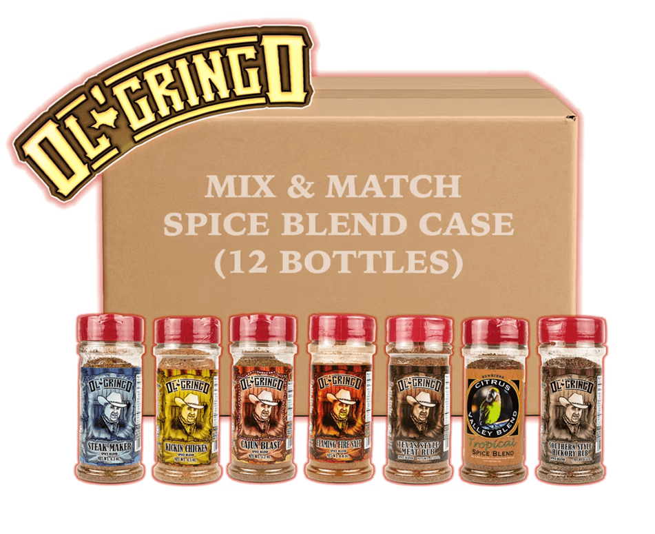
Inspiration
To shape Grandpa Joe’s look and feel, I’m exploring existing spice packaging, mood references, and layout structures that balance handcrafted charm with strong shelf readability.
The Final Run
This direction was selected in stages. GrandPa Joe first approved the illustration and color palette, then reviewed a series of label layout options. The layouts shown here represent the final refinements before arriving at the completed, large-format design.

Why I Show Work in Progress
I like to share the journey, not just the polished outcome. Showing work in progress makes my thinking visible — how research, constraints, and experimentation shape design decisions before anything is finalized.
For clients and collaborators, this offers transparency and trust. For recruiters, it shows how I approach problem-solving with intention, structure, and restraint.
Outcome
This project is in active development, and the foundation is in place: a character-led identity direction, early logo system options, and a warm, spice-driven palette that can scale with the product line.
Next, the work moves into label hierarchy, packaging layouts, shelf mockups, and launch-ready storytelling assets.
Grandpa Joe’s Spices
Brand Development
A behind-the-scenes look at how I build a family spice-rub brand from scratch — strategy, illustration, color, and packaging exploration in real time.
The Challenge
The challenge is translating a personal family origin into a clear, scalable brand system — one that feels homemade, but reads quickly and confidently on a shelf and across digital.
The Insight
The identity needed to feel like the person behind it: friendly, approachable, and instantly recognizable. Anchoring the brand around “Grandpa Joe” makes the story tangible — and creates a foundation that can grow across products while staying true to the family behind it.
What I’m Building
Grandpa Joe’s Spices is a homegrown spice-rub brand rooted in family stories, warmth, and handcrafted flavor.
I’m developing the full identity system — from character illustration and logo design to color, packaging, and launch-ready storytelling.
The goal is a brand that feels personal and familiar, while still being clear, scalable, and confident on shelf and across digital.
Current Status
Character illustration complete, establishing Grandpa Joe as the visual anchor.
Color palette exploration underway, pulling from spice-inspired tones and neutral balances.
Logo lockup refinement in progress, testing multiple badge and framing options.
Packaging layout sketches beginning, focused on hierarchy and readability.
Shelf mockups and social graphics planned as next steps.
Origin Story
How “Grandpa Joe’s” Got Its Name
Grandpa Joe started blending spices to cut back on salt, sugar, and unpronounceable additives. After a lot of tinkering and taste-testing, he landed on a rub with just the right kick, using fresh bulk spices for consistency and flavor. Friends and family kept asking for refills. One night at a burger cookout, his grandson said, “I want Grandpa Joe’s Spice on my burger.” The name stuck — and a backyard favorite began its journey toward becoming a real brand.
Logo Exploration
Finding the Right Expression of Grandpa Joe.
The identity centers on Grandpa Joe himself, friendly, approachable, instantly recognizable, and always smiling.
These early logo studies explore different containers and crops while keeping the same warm, line-art character at the core.


From Research to Concept
Before designing anything, I broke the brand down into its core ingredients, including product use, flavor profiles, visual cues, and storytelling. This ensured that every design decision was grounded in clarity and purpose.
Color Story
Spice-Inspired Palettes
The palette pulls from chili, paprika, turmeric, brown sugar, char, and herbs, warm enough to feel homemade and balanced with neutrals so the brand can expand across products without feeling chaotic.
The Final Run
This direction was selected in stages. GrandPa Joe first approved the illustration and color palette, then reviewed a series of label layout options. The layouts shown here represent the final refinements before arriving at the completed, large-format design.
Inspiration
To shape Grandpa Joe’s look and feel, I’m exploring existing spice packaging, mood references, and layout structures that balance handcrafted charm with strong shelf readability.
Why I Show Work in Progress
I like to share the journey, not just the polished outcome. Showing work in progress makes my thinking visible — how research, constraints, and experimentation shape design decisions before anything is finalized.
For clients and collaborators, this offers transparency and trust. For recruiters, it shows how I approach problem-solving with intention, structure, and restraint.
Outcome
This project is in active development, and the foundation is in place: a character-led identity direction, early logo system options, and a warm, spice-driven palette that can scale with the product line.
Next, the work moves into label hierarchy, packaging layouts, shelf mockups, and launch-ready storytelling assets.