The Challenge
Translate a personal family origin into a clear, scalable brand system—one that feels homemade, but reads quickly and confidently on a shelf and across digital.

Brand Development Case Study
A behind-the-scenes look at building a family spice-rub brand from scratch—strategy, illustration, color, and packaging exploration in real time.
Translate a personal family origin into a clear, scalable brand system—one that feels homemade, but reads quickly and confidently on a shelf and across digital.
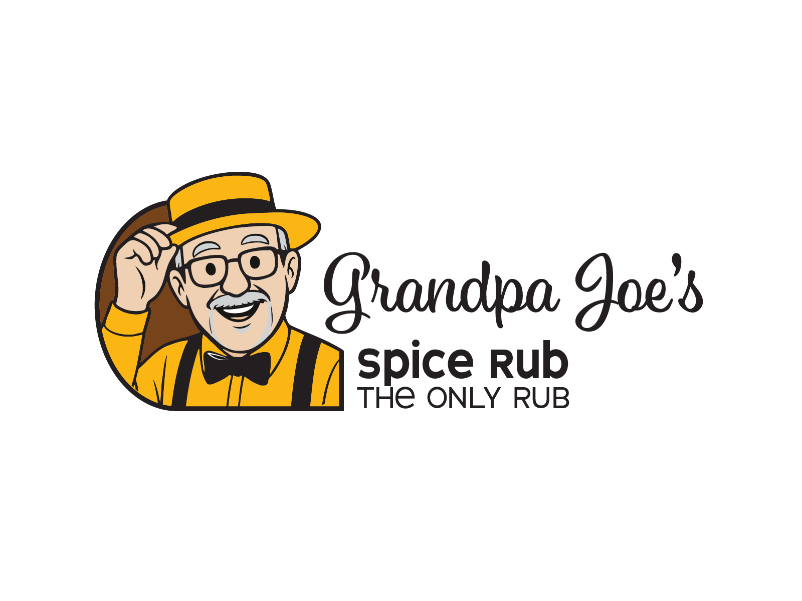
The identity needed to feel like the person behind it: friendly, approachable, and instantly recognizable. Anchoring the brand around Grandpa Joe makes the story tangible.
A full identity system—from character illustration and logo design to color, packaging, and launch-ready storytelling.
Origin Story
Grandpa Joe started blending spices to cut back on salt, sugar, and unpronounceable additives. After tinkering and taste-testing, he landed on a rub with just the right kick, using fresh bulk spices for consistency and flavor. Friends and family kept asking for refills. One night at a burger cookout, his grandson said, “I want Grandpa Joe’s Spice on my burger.” The name stuck—and a backyard favorite began its journey toward becoming a real brand.

From Research to Concept
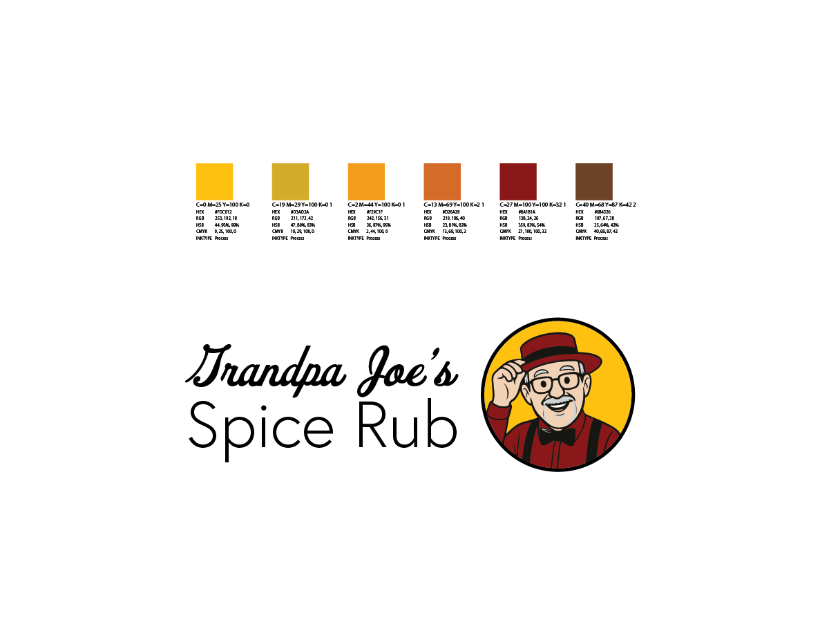
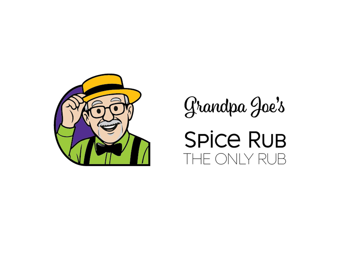
The identity centers on Grandpa Joe himself—friendly, approachable, instantly recognizable, and always smiling. Early studies explore different containers and crops while keeping the warm line-art character at the core.
The palette pulls from chili, paprika, turmeric, brown sugar, char, and herbs—warm enough to feel homemade and balanced with neutrals so the brand can expand without feeling chaotic.
The direction was selected in stages: illustration and color first, followed by label-layout review and refinements toward the completed large-format design.
Current Status
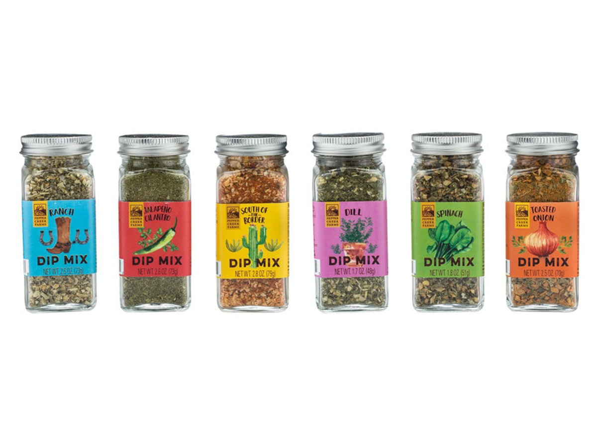
The character illustration establishes Grandpa Joe as the visual anchor. Color, logo lockups, label hierarchy, and packaging layouts continue to develop toward shelf mockups and launch-ready storytelling assets.
Why show work in progress?
Sharing the journey makes the design process visible—how research, constraints, and experimentation shape decisions before anything is finalized.